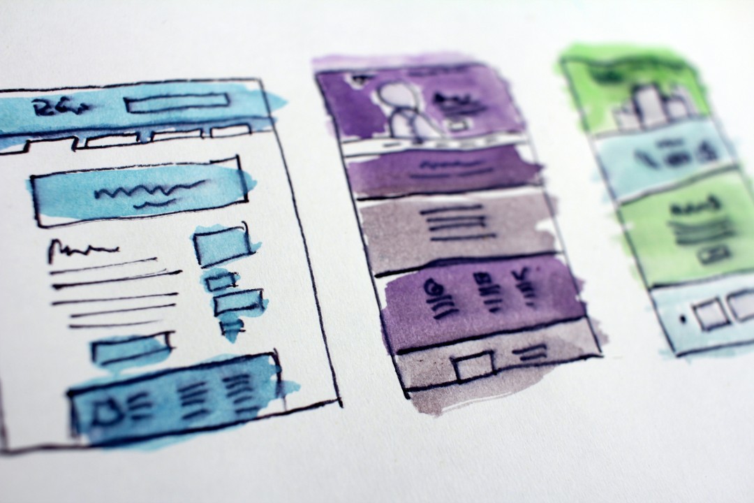
User Experience (UX) Design Techniques to Increase User Loyalty
Christos S. Karpasitis, Ph.D.
Assistant Professor in Digital Media and Course Leader of the BSc (Hons) Web Design & Development at the University of Central Lancashire, Cyprus Campus
What is it that encourages a user to keep visiting the same websites? Many of us would attribute the success of a site to a well-written code or elegant graphics.

But if you think about it, many times even a simple website manages to keep users loyal to its content. This is because interactivity depends on the elements of each web page and the dynamic flow between them. In short, the secret of a successful website lies in UX Design and on understanding how UX principles work.
In the following article we will look at some User Experience (UX) Design techniques that can be used to improve the user experience and increase a website's loyalty.
UX Design is broad and requires patience to fully understand it. But the more you deal with it, the more you will understand it. The best way to get started is to browse websites that you like, so that you understand exactly what attracts you the most. In this way, from your own experience, you will be able to understand why you remain committed.
Contrast attracts attention
Each website is structured with elements designed for interaction: links, buttons, input fields, etc. However, it is important to recognise that only some of these elements are important to the visitor and therefore these are the ones that should be attracting attention in terms of design, in order to stand out from the rest. This idea is related to colour contrasts and the way the human mind processes visual data. More specifically, when something stands out from its environment due to colour, shape or relative position, it can be seen as significant.

Use contrasts to draw the user's attention to specific elements that encourage visitors to interact. If your goal, for example, is to increase newsletter subscriptions, the subscribe button/icon could be bright and moving.
The goal is to capture the visitor's attention and to create Call to Actions (CTA) by designing elements that guide him or her to perform specific actions.
At this point, it is important to mention that it is worth running some tests to statistically distinguish which colour-element combinations work best.
Elegant UI/UX animated graphics
Different types of animation persuade different behaviours. For example, a button can bounce when a visitor hovers over it to indicate that it is clickable, as opposed to neighbouring elements. Also, some error messages often vibrate to grab the user's attention.
Also, keep in mind that animation should be clear and discreet at the same time. This does not mean that the User Interface (UI) must be one-dimensional. In fact, most users prefer some kind of animation because it gives the illusion of a smoother user experience. Digital design partially creates an illusion of usability, but the more realistic it is, the more it encourages user interaction.
Responsive Design is essential

It is safe to assume that a large percentage of users use smartphones to browse the Internet nowadays. Visits to links that are posted on Social Media, such as Facebook, Instagram and Twitter, are often made from smartphones or tablets. For this reason, every website should be available for use on smartphones, preferably with a fully responsive design. To achieve this, it is crucial to take into account the sizes of different smartphone screens and all the critical features that differentiates smartphone browsing from PC or laptop browsing. For example, you need to choose which of your website's features are most important and how these features should be displayed on smaller screens. A responsive design takes time to perfect, however, the best way to do it is to first study other websites and choose the techniques that work best for your website and users.
The truth is that responsive design works effectively and is becoming a must for the design community. This is because users themselves expect websites to be compatible with any kind of screen. If a page does not respond to smartphone browsers, most probably it will harm the user's experience.
Simplification of interaction processes

During a train/bus trip, none of us like to go through many stations/stops to reach the desired destination. Similarly, website users are solely interested in the end result and the fastest way to get there.
In fact, the browsing process does not matter that much, as long as it is straightforward and simple. The important details of your website should be clearly visible. It is a big problem for a user who ends up on your page, not to immediately realise how to register. In other words, the interaction features on your website must be crystal clear.
A good start is to look for UX designs, combined with the user interaction process with an interface. In this way, you can come to conclusions about your own website and the ways in which you can fully simplify it.
Conclusion
There is no short answer on how to design websites that enhance usability. There are always specific suggestions you can try, but each website is different and studying UX Design is complicated.
This article provides some common techniques to design a UX friendly browsing environment. However, the best thing you can do is to put yourself in the shoes of a typical user and identify your own website's weaknesses and problems. In this way you can quickly come up with possible solutions.